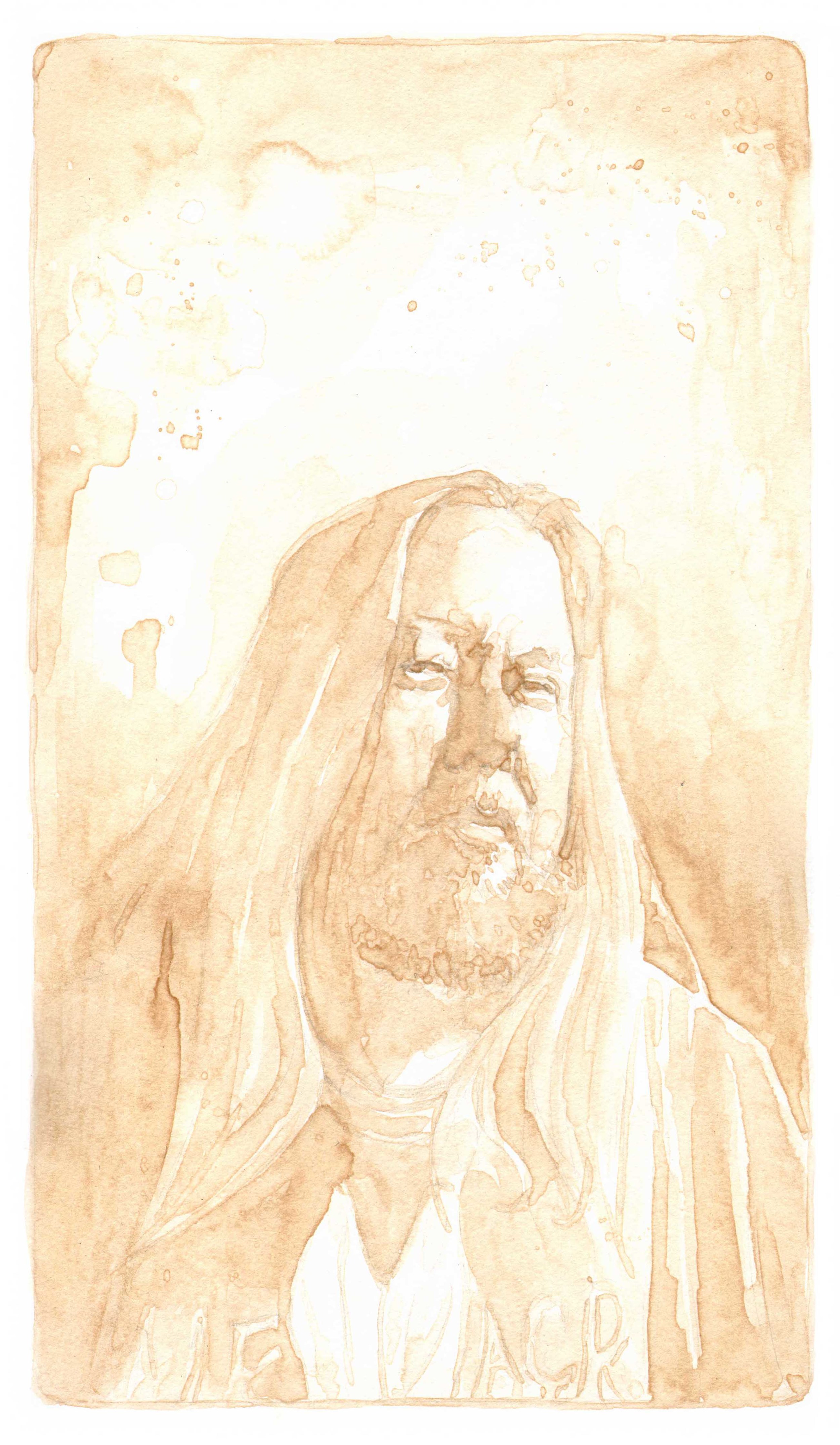
Interview and portrait by Kyle Bice

Phineas X. Jones is the creative talent behind the labels at Half Acre Beer Co. in Chicago, IL. If you live in the city, you have most likely seen his work rolling by on the side of a large beer delivery truck. His art is featured on beer labels, cans, posters, decorative tins, tee shirts, glassware and on and on the list goes. And that’s just what he does for Half Acre! Phineas is also a successful poster artist, having done illustrated gig posters for acts like Dinosaur Jr. and Phish, and for Chicago’s Lollapalooza music festival.
His work is rooted in a turn of the century illustration style mixed with a handful of psychedelics and beer. Phineas’s work is always unique, interesting and eye catching.
I’m lucky enough to know Phineas and was able to get him out of the studio to pose for a portrait and to answer some questions about his experience as a label and poster artist.
KB: What was your path to ending up at Half Acre Beer Company in Chicago? Did they find you or did you find them?
PJ: Gabriel (president of HABC) emailed me one day out of nowhere to ask me if I wanted to design a beer label. I believe he'd seen one of my screenprints at a mutual friend's office. But it wasn't work I went out looking for.
KB: Not many people know the process for creating a beer label. While it’s certainly going to be different at every brewery, can you take me through your process of illustrating a beer label from start to finish?
PJ: There isn't any one set process. At least not here. It's pretty all over the place as to how much planning or high concept goes into any one label. In general it starts with '[Beer X] is getting bottled on [Date] and we need a label'. Depending on how far that future date is from the current date is usually what determines how much process we get to have in arriving at a design. In always involves some amount of back and forth between Gabriel and me to nail down what the idea is. Most of how it ends up looking is up to me of course. Sometimes G will have a very specific idea and it will take more tries to hit it. Other times I'm mostly on my own. Things that get a little more time and attention tend to be our major seasonal releases, like Double Daisy Cutter and Big Hugs. I might work on a Big Hugs design for most of a month. But other labels I have literally had to do in a single day. It's always an adventure.
KB: Where do you draw your inspiration from for each label you work on? Do you start with the flavor of the beer? The ingredients? The name?
PJ: In general it's going to be based more on the name, and whatever concept for it Gabriel has in mind. Unless it's an annual seasonal release I will usually not have gotten to try the beer before the label has to be finished. Since, by the time the beer is finished the label also has to be so it can be bottled. In certain cases a name will give me a really strong inclination for visuals. Or else Gabriel will have a really specific idea. Other times neither of us will and it take a bit of flailing to arrive at something. And in the case of seasonals, it's often a case of having to think up new things for a giant kitten or a two-headed donkey to be doing every year.
KB: I know you’re full time with Half Acre but you’ve done a bit of work with Three Floyd’s recently. Is their process any different for you? Do you get to challenge yourself in new ways there?
PJ: The challenge with Floyds stuff is trying to keep up with Nick Floyd's bizarro imagination. Just try to reconstruct the creative brief that resulted in the Battle of Charro (first image on https://octophant.us/3floyds/). I dare you. Anything I come up with could have always been bigger, crazier, or could have used more Mongols. There's really no going too far on a Floyds design.
KB: Of all the labels you’ve worked on, do you have any favorites?
PJ: The first label I did was the first release of Big Hugs. I've done six years worth of Hugs labels now (and the last two years were double labels). He's definitely the thing I look forward to working on every year. Figuring out what he'll be destroying with either love or fire.
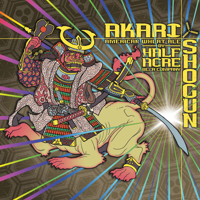
Alternately, I'm really proud of all the can designs I've produced. Cans are a special challenge unto themselves. With the type of printing we've used, you can only have seven colors or screens thereof (one of which will always be bare aluminum) so it takes a lot more planning and trickery than a full color design. Especially on complicated ones like Akari Shogun.
KB: I’ve seen your illustrations on labels, posters, shirts, cups, and the sides of delivery trucks. What's it like to see your art pop up all over Chicago?
PJ: Not that I'm anything like famous now, but I was never going to be famous based just on stuff I draw, so it's really nice having a fair sized commercial endeavor pushing my images in peoples faces for me. I love seeing strangers unwittingly wearing t-shirts I've designed. And that Akari Shogun truck that rolls through my neighborhood on a regular basis is one of my favorite things in the world. I'd drive it myself if I could. Of course most people aren't going to know I made any of that stuff and I certainly don't go around announcing it to strangers. But I know it.
KB: Outside of the craft beer world you’ve also done several posters for musicians and music venues. Can you tell me a little bit about your poster making process? What posters have been the most challenging to work on? Do you have any favorites from the past few years?
PJ: Like labels the process on gig posters is really variable. Usually the clients who are paying more tend to have a lot more opinions about how things should turn out. The smaller things, like posters for local venues, are way more free-form and as long as the final product has the right information on it almost no one will have anything to say about how it looks.
The hardest gig posters are for bands I really like. It's much easier to make some crazy thing for a band I have no feelings about. If it's a band I love I want it to be perfect and I will make myself crazy over it.
If I have an all time favorite, it's probably getting to do the poster for Lollapalooza 2010. It was a ton of work, and I had to fit in literally 100+ band names, but I still mostly like how it turned out. Also it paid the most of any poster job I've ever had, which makes for nice memories. (If you would like a copy of that poster, reader, don't email me. I don't have any more. It was 5 years ago. Don't. Email.)
KB: What’s next for you? Do you have any new projects you’re working on that you want to share?
PJ: Since I have a full time job I don't tend to take on a lot of big side projects. I'm old and I don't like working 18 hour days any more. If HABC ever gets around to firing me that will all change pretty quickly, but for now I enjoy keeping work in the work box and not having to stress about where next month's rent is coming from. So, nothing of particular note coming along, really. But there's always another beer label about to come out.
KB: Last question, this one is pretty open, what does art mean to you?
PJ: One of my preferred job titles (for the odd occasion when someone asks) is Trash Decorator. I don't have any delusions about the standing of a guy who draws things on beer bottles in relation to some world of capital-A Art. So I wouldn't say I think a whole lot about art or what it might mean. I just want to make things I think are cool and that maybe other people like looking at and ideally none of it should mean anything.
You can view Phineas’ work at
https://octophant.us/
https://theoctophant.tumblr.com/
And make sure to stop by Half Acre Beer Co. next time you’re on the North side of Chicago!
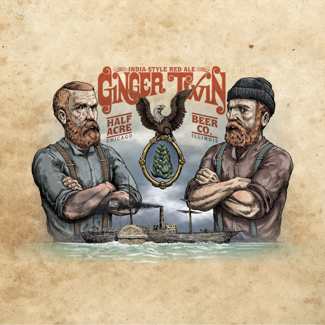
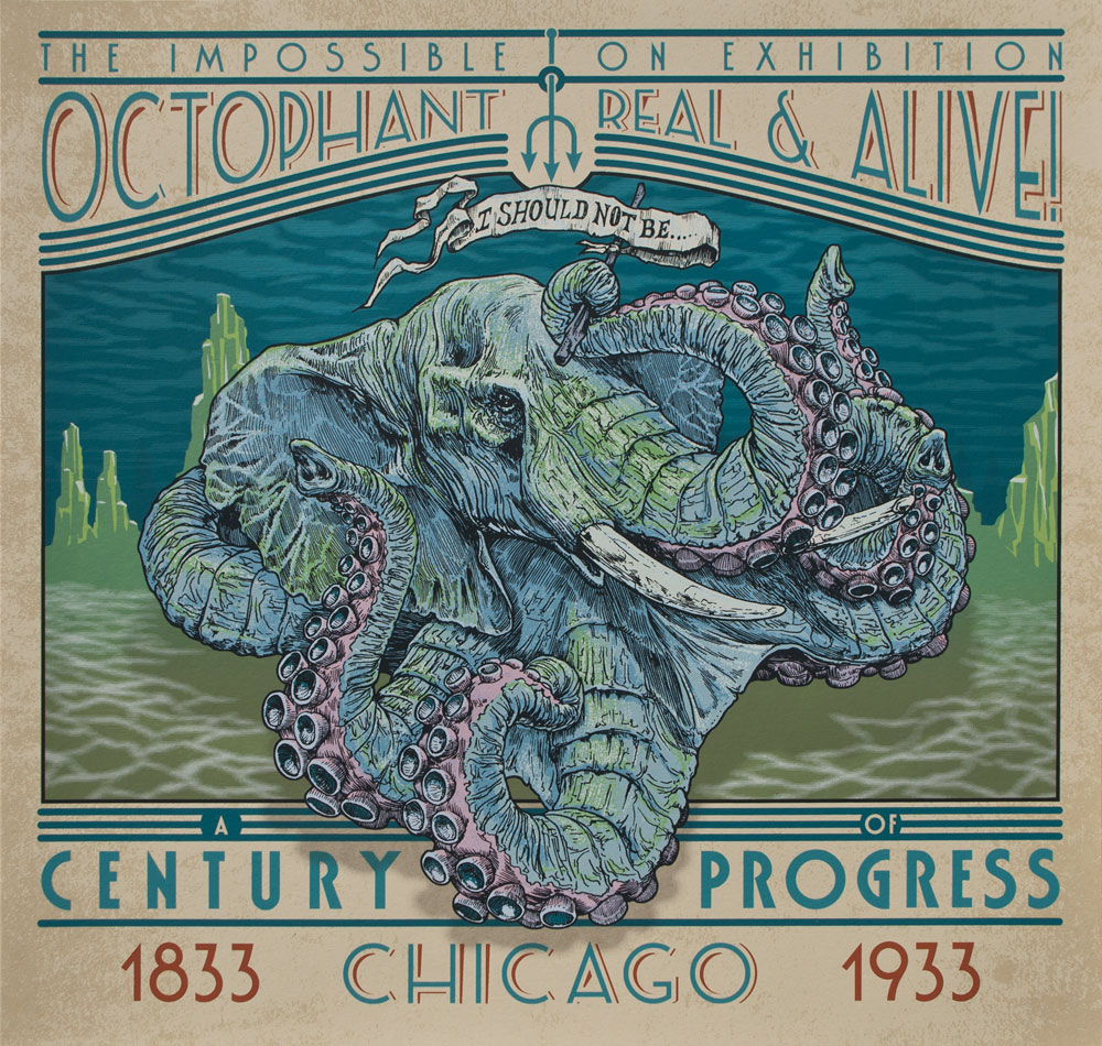
Below are a few of my favorite illustrations by Phineas.


